The Prediction Market Paradox
There’s a reason why campaigns are eager to publicize polls that show them ahead, while downplaying those in which they happen to be trailing. The perception that a candidate is losing can depress donations and volunteer effort, and lower morale and turnout among supporters. Hence polls that show tightening of a race are often advertised as indicators of momentum by the trailing party, and as outliers by the leader. The actual likelihood of victory is not independent of beliefs about this likelihood.
This gives rise to what might be called a prediction market paradox. If prices are widely believed to accurately reflect underlying probabilities, then there is an incentive for deep-pocketed partisans to try and manipulate these prices at the margin. But if the possibility of manipulation is salient and prices are treated with skepticism, then incentives to manipulate are weakened and prices will in fact be quite accurate reflections of underlying beliefs.
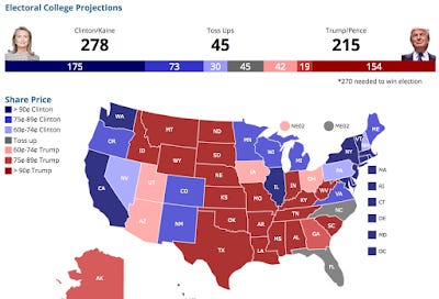
An interesting illustration of this phenomenon is the recent decision by PredictIt to post an electoral college map, updated by the minute, that aggregates probabilities derived from all its state level markets. Here's what the map looks like at the moment:

There are seven categories: the safe, likely, and leaning states for each candidate and one toss-up category. States shift across categories as prediction market prices cross the relevant thresholds. This way, a broad range of probability assessments is mapped onto a much coarser set that is easy to visualize and process.
But this creates the possibility that small changes in price, of the order of one cent, can lead to reassignments across categories that generate a very different picture. The incentives to manipulate prices is amplified whenever such categorical switches are feasible.
Of course these incentives apply to both sides of the market, with some traders wishing to shift states to the left while others are pushing to the right. As a result, an unusually large number of states may be expected to bounce back and forth across boundaries, and to remain within a narrow band of prices close to those selected (somewhat arbitrarily) by the exchange as thresholds.
This seems to be what we are seeing. The boundary between the lean and likely Clinton states is determined by a 75% threshold, and we see four states (Wisconsin, Michigan, Colorado, and Pennsylvania) all within a point or two of this. Here are those above the threshold:

And those below:

New Hampshire is not far from the boundary either.
All this could be just coincidence, but if one looks at probabilistic forecasts from other sources, there is no such pattern. The New York Times conveniently collects six probabilistic forecasts including it's own, with the current picture looking like this:

These forecasts (from the Times, FiveThirtyEight, Huffington Post, Predictwise, Princeton Election Consortium and Daily Kos respectively) don't appear to be clustered around the PredictIt thresholds at all.
Still, the evidence is anecdotal at best, and a proper analysis would have to look for a discontinuity in prices around the time that the map was created, with a clustering of prices around boundary points that could not be accounted for by random chance alone.
Meanwhile, some caution is probably warranted in interpreting prediction market data. This is a case in which the ease of visualization, aggregation and dissemination of data can have an impact on the underlying measurements themselves, and indeed on the objective probabilities that the measures are intended to reflect.


